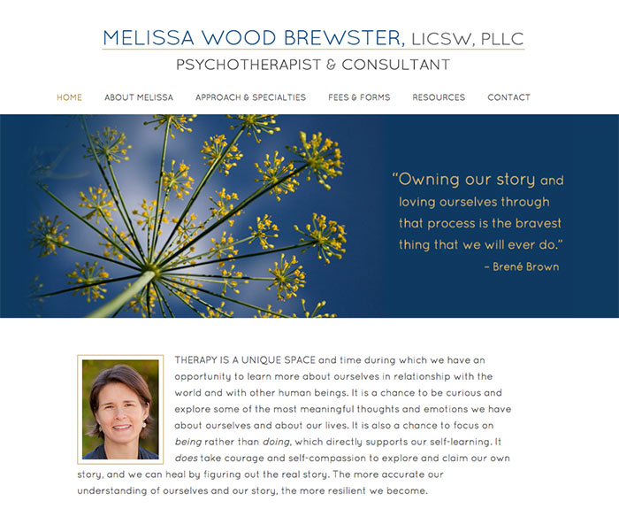
These “before and after” studies show how I use overlapping skill sets — design, imagery, typography, and user interface design — to provide results that not only look good, but improve how these clients are perceived by their clients and customers.
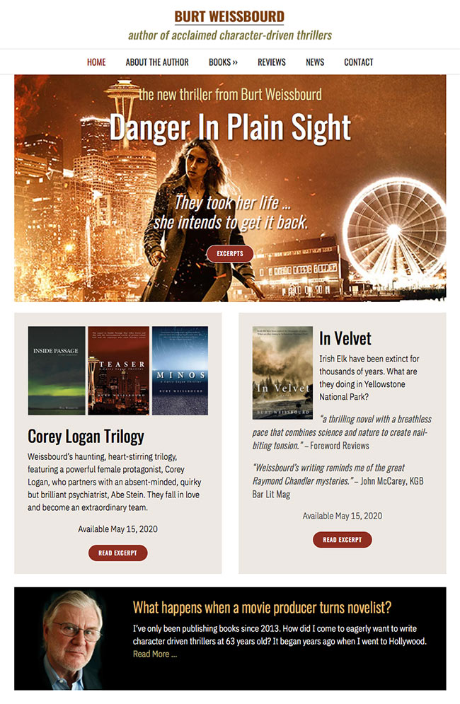
 WEBSITE REMAKE FOR AUTHOR BURT WEISSBOURD
A redesigned front page clears up busyness and places greater focus on what’s most important — the books themselves.
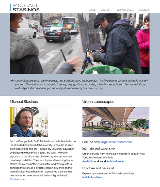
 WEBSITE REMAKE FOR PAINTER MICHAEL STASINOS
An artist’s presentation must showcase the work in the most professional light, but not detract from the artwork itself.
 WEBSITE REDESIGN FOR WOOD BREWSTER PSYCHOTHERAPY
A full makeover retains the same basic elements but improves overall tone, adds better organization, and a more spacious layout.
Website redesign for author Burt Weissbourd
 BEFORE: The front page is the most important page of a website. It not only tells visitors what’s most important, it also sets a tone. That tone forms an impression in the visitor’s mind that may be consistent with the product or service — or not. The original front page leads with the author’s books, but otherwise lacks a hierarchy. There’s too much going on, too many words and too much for the visitor to sift through. The front page should not fill in all the details, but direct us to the areas that we are most interested in.
AFTER (below): The redesigned front page brings greater focus to what’s most important — the books themselves. The newest book is placed front and center with a bold image that draws the eye in. Previous books are also nested just below that, setting up a visual hierarchy. Each section is like a “block,” easy for the eye to focus on, and easy to interpret without having to read too much. The visitor finds a more visually engaging presentation while being able grasp the author’s message more clearly. New fonts were chosen that were more appropriate for an author.
Visit the Burt Weissbourd website.
Website remake for painter Michael Stasinos
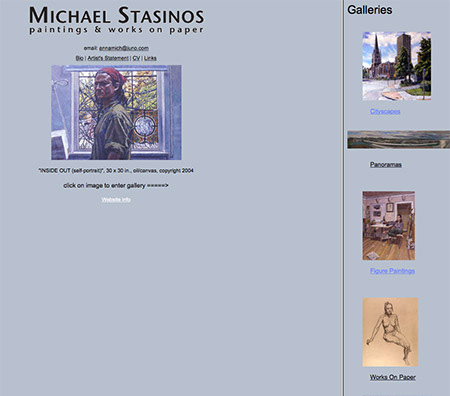 BEFORE: It is particularly important for visual artists to make a strong presentation that displays their work in the best possible light. Stasinos’ former site had no real design. On the home page the artwork wasn’t large enough, and there was a large blank area. Nor could Michael make updates to the site himself. This is something that would have been very hard to do with the HTML platforms of 10 years ago, but is much easier to do now with the modern platforms used today.
AFTER: The new site was offers all the features of a modern site: a blog component, a rotating slide show on the home page (some painters choose a single, large static image), and in the portfolio sections, large images of the artwork, which is so important for displaying the painter’s work. Michael also asked for an “In Detail” section that allows visitors to zoom in on the paintings to more fully appreciate his detailed style. With approximately three hours of training, Michael is now able to update his portolios and create blog posts himself.
Visit the Michael Stasinos website.
See websites for artists by an artist.
Website redesign for Wood Brewster Psychotherapy
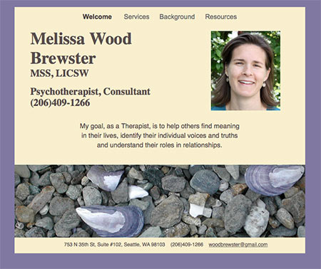 BEFORE: New clients often approach me with outdated sites that have been sitting dormant for many years. (Even five or six years is very old on the web.) They see the newer websites of their colleagues and realize that just because their site has the correct information doesn’t necessarily mean it conveys the professional image they want. This is extremely important for healthcare professionals. Visitors not only want to see that “this is a professional,” they also need to get a sense of warmth and safety.
AFTER: Wood Brewster wanted a simple design, without clutter, and lots of white space. The redesigned home page contains the same basic elements as the old version, but in a more organized and spacious layout. The header with her name is replaced by one with distinctive typography and personality; a larger and more interesting nature image is used; her photo is closer to her introductory text; and the color set — blue and gold — has a more contemporary feel.
Visit the Wood Brewster website.
